|
Client:
Cherry Corporation
Background:
Cherry had four different divisions - each "doing their own thing"
regarding the Cherry brand/identity. When we were first awarded the account,
we proposed the development of a company-wide branding/identity, but Cherry
saw no immediate need. That is, until the company president attended a
global key account meeting with his division managers and was struck by
the array of business cards and literature. Cherry looked like four different
companies!
While the president
wanted a new company-wide look, he was also well aware that the German
division was intent on its brand identity - and particularly its color
scheme.
Brand
Identity:
Over the course of the next several months, we utilized research on the
affect of various colors upon individuals plus we examined the current
state of design, typeface and color acceptance in both Germany and the
U.S. This research enlarged our understanding of some of the color and
design issues we might face in Germany. Then, armed with this information
we visited the German facility to both discuss the task at hand and to
solicit their input. Once a spirit of understanding and a willingness
to work together was established, we entered into the design phase.
The
Result:
Through the virtue of our discussions - and the creation of a design that
included some of the German division's most cherished elements, but in
a far less spectacular way - we were able to create a look that all could
agree on.
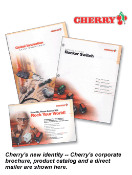
A brand identity
manual, an update of the Web site, a corporate brochure, new stationery
and business cards and direct mail soon followed.
|